Merriment Coffee Co.
Branding, Web
Brewing A Timeless Brand
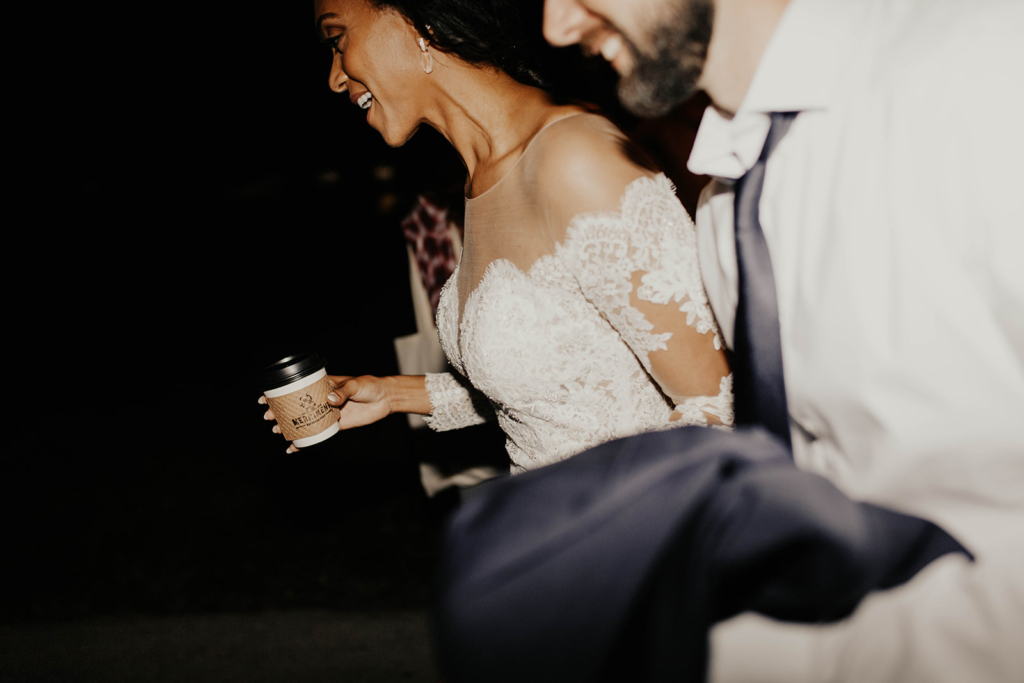
When Merriment set out to launch their premium mobile coffee service, their vision was as refined as their lattes: create a brand identity that felt upscale yet inviting, designed to elevate every wedding or event they served. They wanted to feel like the favorite local café, but with the elegance of a black-tie experience.
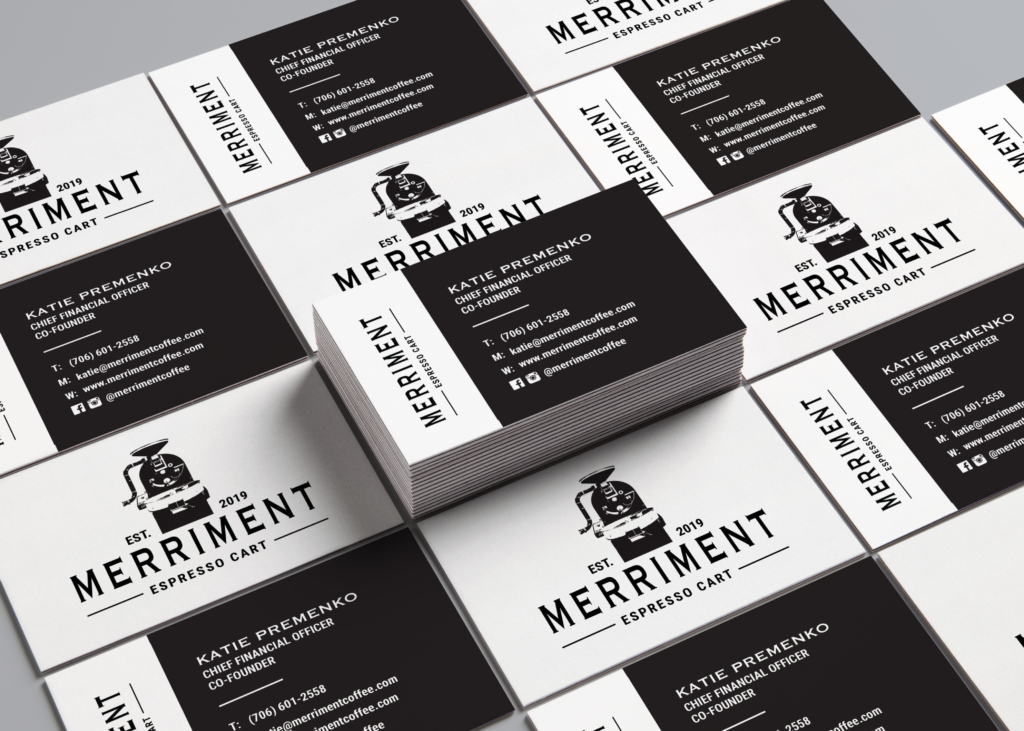
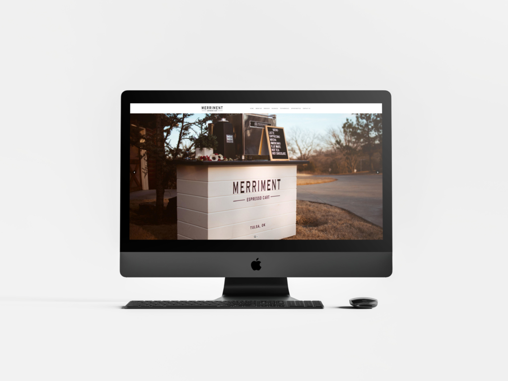
From the very beginning, it was clear this would be more than a logo. It needed to be a complete visual identity system. Something that could translate across menus, signage, cups, uniforms, and digital content, while still feeling cohesive and timeless in any environment from a backyard barn to the Mayo Hotel.
Sophistication In Every Pour
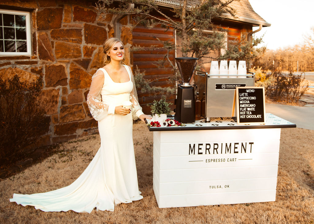
Together, we created a brand identity that reflects Merriment’s mission: to deliver an exceptional coffee experience with warmth, grace, and style. Every detail was designed to blend charm and refinement—from the serif typeface and hand-drawn accents to a muted color palette that feels both modern and romantic.
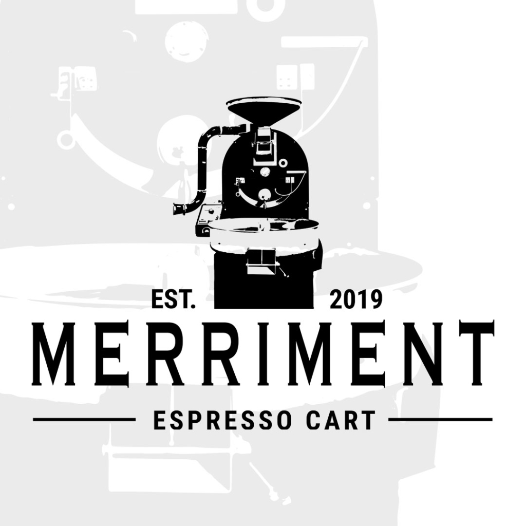
At the center of the system is a logo suite that includes:
• A signature mark inspired by vintage café emblems
• Alternate lockups for cups, signage, and mobile carts
• Brand typography that nods to tradition without feeling dated
• A color palette rooted in soft neutrals and warm espresso tones
• Style guidelines for visual consistency across all platforms
The result? A brand that fits seamlessly into any environment, whether it’s a backyard wedding in Austin or a luxury celebration in Napa Valley.
This brand wasn’t just designed to look good; it was built to belong. Merriment now shows up with the kind of cohesive brand presence that enhances every event they touch. Whether they’re serving cappuccinos at a morning ceremony or espresso martinis during golden hour, the branding feels intentional, elegant, and unmistakably “them.”
From social media to serving carts, every element of Merriment’s visual identity is built to scale beautifully. With their new brand system, Merriment is ready to expand their presence across the country offering a luxury service that looks as polished as it tastes.
Looking To Elevate A Luxury Brand of Your Own?
We build brands that move with your mission and would be honored to talk about how we may serve you best.
