How a Bold Visual Identity Elevated a Strategic Marketing Agency
Golden Compass Marketing had the vision. What they needed was the brand to match.
Led by Kirsten Zier, the agency already had a reputation for delivering high-level marketing strategy, but its visual presence didn’t yet reflect the energy, clarity, or modern polish behind its work. From the start, Kirsten made it clear: this brand needed to feel vibrant and professional; warm and intelligent in equal measure.
It needed to earn trust in the boardroom and feel at home on Instagram.
And most importantly, it needed to grow with the business for years to come.
A Visual Identity That Serves Two Worlds
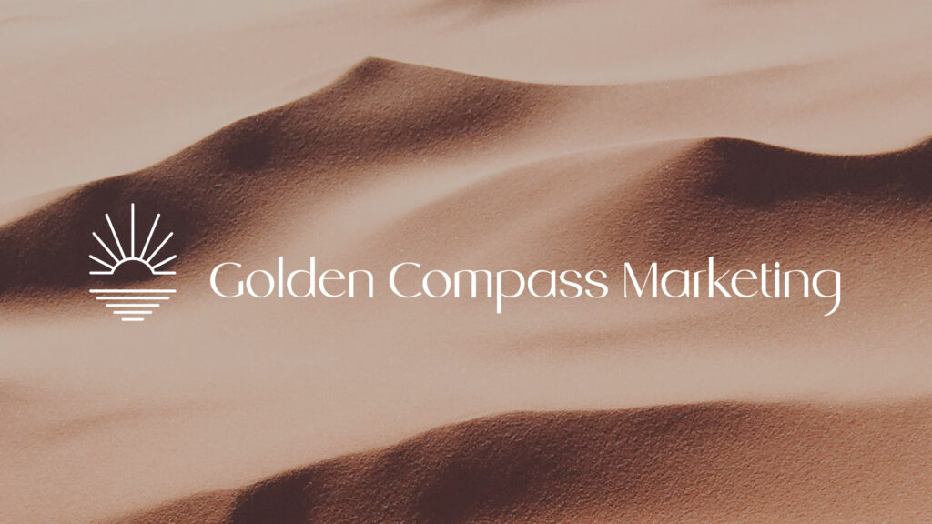
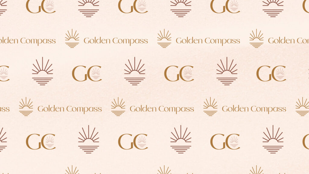
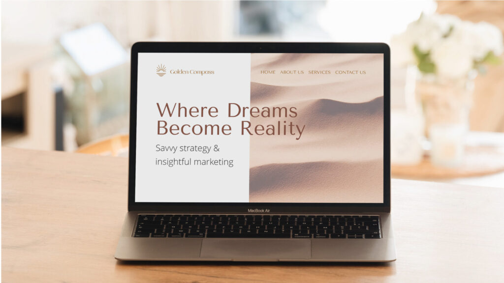
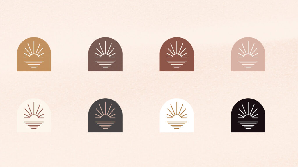
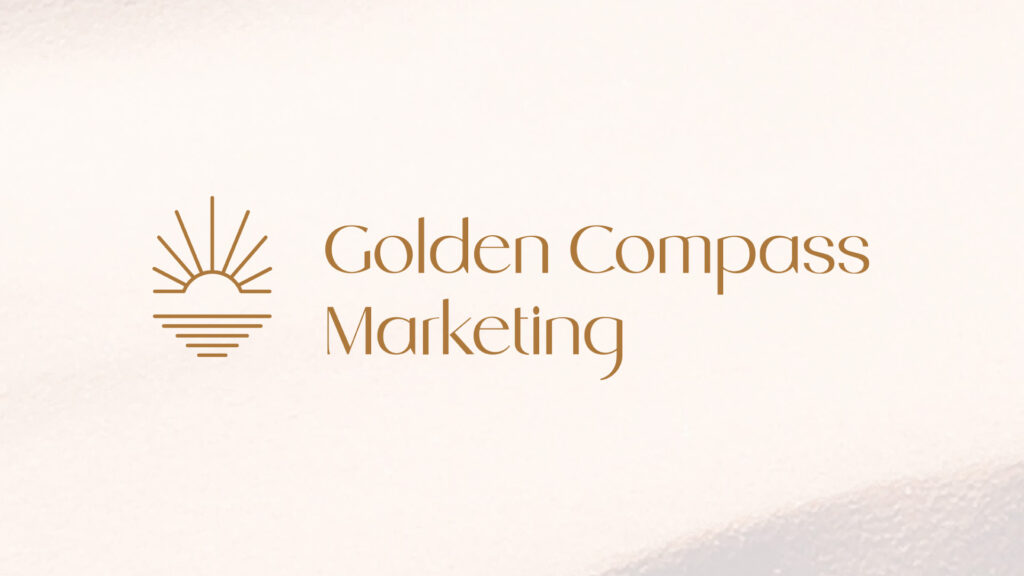
At the core of the new identity is a logo inspired by sunlight, clarity, and forward movement. The sunburst mark symbolizes energy, optimism, and direction; values that guide both the agency’s mission and its clients. This was more than a logo, it was a custom visual identity system built to scale across every touchpoint.
Golden Compass needed a brand that could resonate with two distinct audiences:
• C-suite executives and high-level corporate stakeholders
• Modern content creators and social-forward entrepreneurs
To serve both, we built a system that balances precision with personality. Fonts are elegant but friendly. The mark feels iconic without feeling cold. The palette evokes both confidence and creativity.The new identity now supports Golden Compass as it grows across verticals, building stronger brand equity with every client win and campaign launch.
Looking to Elevate Your Brand?
If you're in the DFW area and ready to take your own brand idea from vision to reality, we’d love to hear what you’re building.